
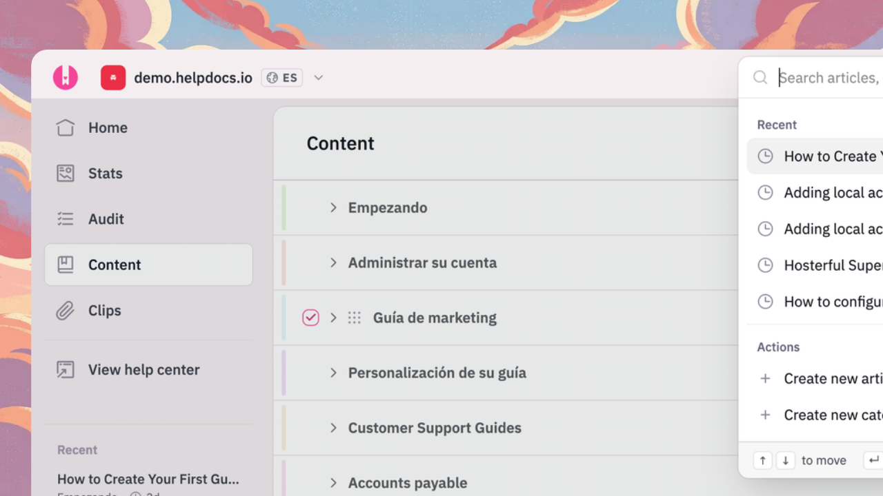
We've revitalized the search and navigation of the app to make it easier to use as the product grows.
Before, a few things you used every day were spread around the sidebar, the search box, and a long row of settings tabs. They're now where you'd look for them first.
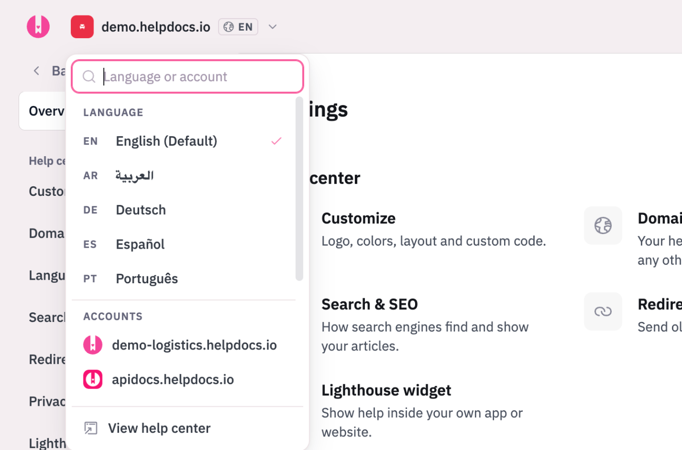
One switcher for account and language
The control next to your logo shows which help center you're in and, on a multilingual account, which language you're editing. Click it to change language in two clicks, or jump to another account. Have a lot of either? Start typing to filter the list. The language picker used to sit in the sidebar, so if you're looking for it, it's here now.
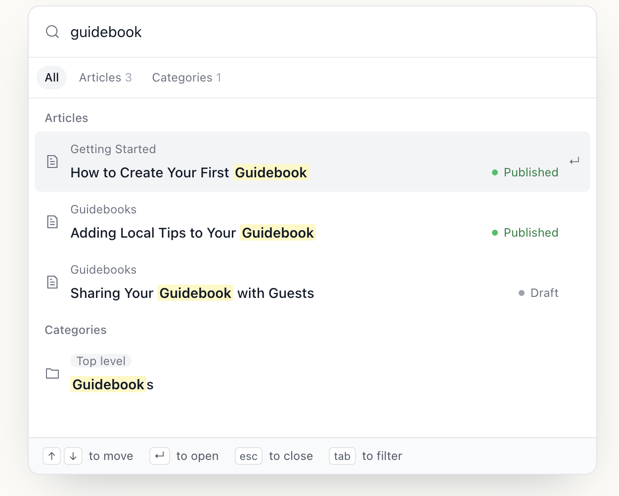
Search that does more than find articles
Press ⌘K (or Ctrl K on Windows) from anywhere. One box searches articles, categories, product updates, and settings pages, with filters to narrow to one kind. Open it with nothing typed to see your recent articles. It also takes actions: create an article or a category, switch language by typing its name ("french"), or move to another account.
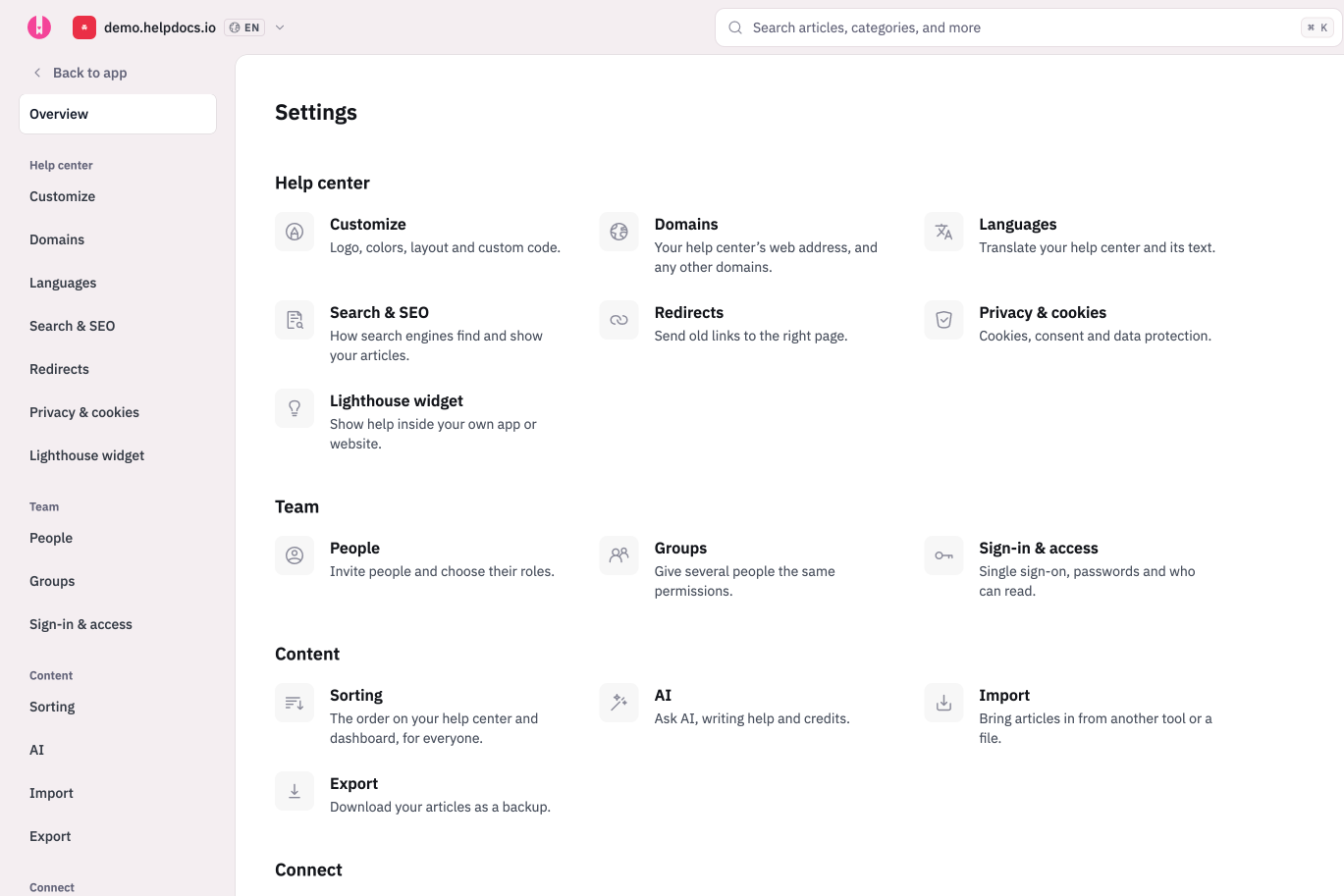
Settings you can find your way around
Settings now has its own sidebar, grouped into Help center, Team, Content, Connect, and Account. Each page has a proper URL you can bookmark or send to a teammate, and wider screens get an "On this page" list so long pages are easier to scan. Can't remember where something lives? Search for it with ⌘K.
Preview your customizations before they go live
Customize is now one editor with your help center right beside it. Change a color, your logo, or your CSS and the preview updates as you go, on a private draft your readers can't see.
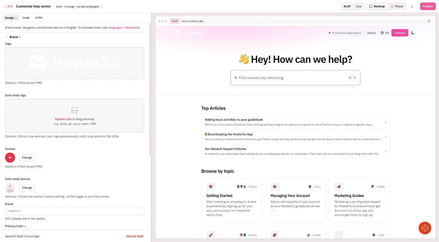
- Draft or Live. Flip between your draft and what readers see today to compare them.
- Desktop or Phone. Check the full desktop layout, then the phone view, without resizing your window.
- Dark mode. See how your colors hold up for readers who browse in dark mode.
Publish when you're happy with it, or discard the draft and nothing changes. If someone else publishes while you're working, we'll tell you before anything gets overwritten. Testing customizations with .dev
Why we changed it
HelpDocs has picked up a lot of features over ten years, and the navigation grew one tab at a time. The result was a settings screen that made you hunt and a language picker people couldn't find. This puts the things you reach for most in one or two places, so you spend less time looking and more time writing.