Table of Contents
Understanding Lighthouse
Lighthouse makes it plain sailing for your users to help themselves without ever leaving your app or website. Here's the various states and actions users will see within your widget.
Lighthouse makes it plain sailing for your users to help themselves without ever leaving your app or website. Here's the various states and actions users will see within your widget.
General Overview
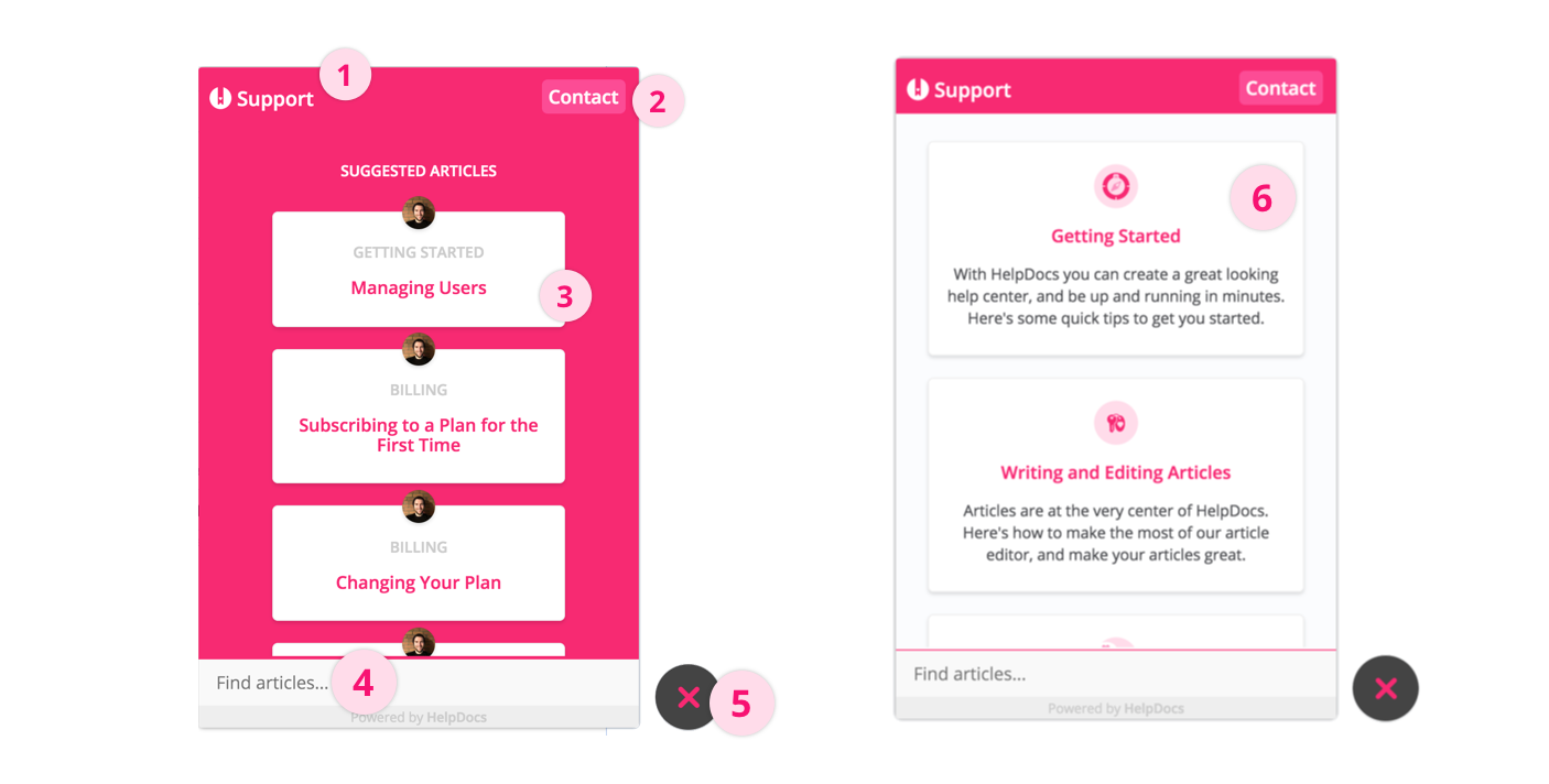
- Navigation bar
- Contact form/live chat button
- Article suggestions
- Instant search bar
- Widget toggle
- Categories & articles
Navigation Bar

The navigation bar helps users control where they are within your widget. We'll use your uploaded logo to the left and your brand name to the right from Settings > Brand.
Contact Form/Live Chat Button

The contact button helps users who can't find an answer from your knowledge base get in touch with your team. If you have a supported Live Chat product on the page where you've installed Lighthouse, we'll trigger that when someone hits Contact. If not, we'll show an email contact form.
Contact forms submitted through Lighthouse will be included in your contact forms Stats.
Article Suggestions
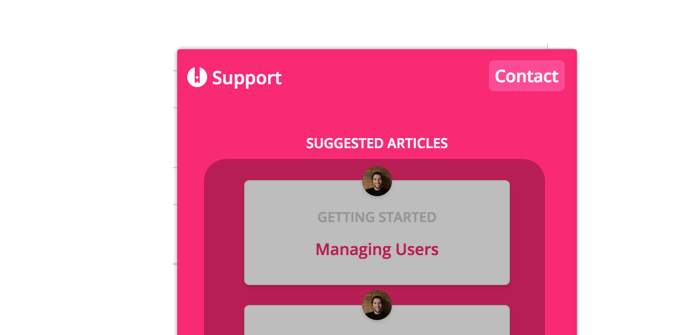
Lighthouse offers the ability to provide smart contextual help. You can set up articles to be suggested depending on the page your users are currently on.
To start creating suggestions, use the suggestions config value to either suggest specific articles, articles within a category, or all articles with a certain tag.
Instant Search Bar
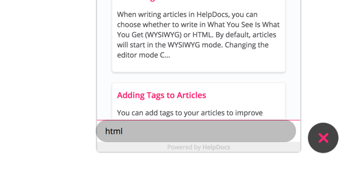
The search you know and love is included within the Lighthouse widget. As soon as a user start typing, they'll see article suggestions appear.
Widget Toggle
Lighthouse can either expand to provide information or hide away ready to be helpful. By default Lighthouse will appear in a closed state, although you can trigger behaviour using the Widget API methods.
When in a closed state, the Lighthouse icon will show. Depending on your primary color, it'll either show a light version or a dark version.
color_mode config value in the Widget API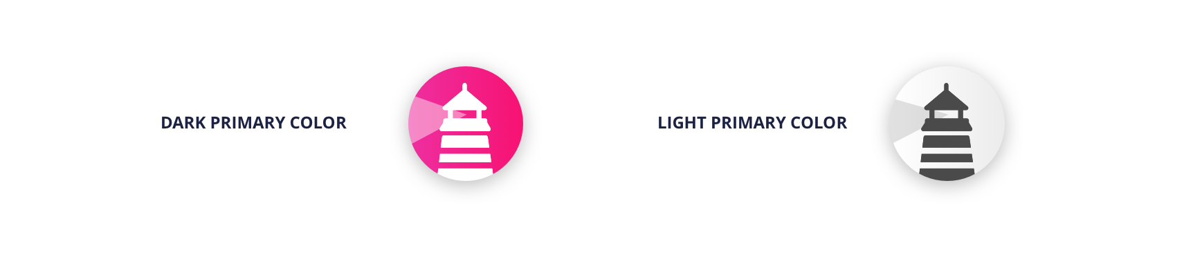
Categories & Articles
Just like on your knowledge base, users will be able to browse categories and articles to find information.
Your custom icons will show on category cards as well as any custom meta information you've added to categories and articles. Custom ordering will also stay intact.
What did you think of this doc?
Installing Lighthouse
Integrating Lighthouse with Live Chat Providers